University Health network
UHN virtual library redesign
Problem statement
As Canada's largest teaching hospital, UHN employs over 35,000 staff members and learners. Their Virtual Library, initially established in 1999, has been expanded over the years using a new CMS, which has led to a confusing mix of navigation menus. Since they never hired a product design team, usability testing was never conducted. They now need to develop a plan to standardize navigation across the entire site in order to reduce confusion and enhance the user experience.
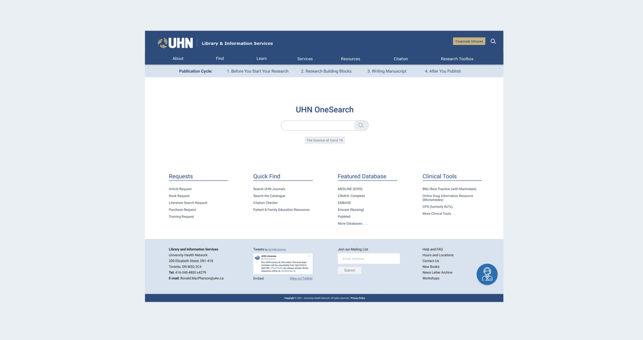
Original website
Overview
Project type: UX design
My roles: I led building wireframes and prototypes as well as evaluate the design through user testings. I also participated in brainstorming, interviewing, creating persona, and drawing experience map.
Teammates: Leiqin Shen(Researcher), Wing Lam Tse(Designer), Tsz Hin Yung(Visual), Running Zhang(Researcher)
Date: Jan - April, 2021
Onboarding
We arranged a meeting with the stakeholders to learn more about this project and learned the messy navigation problem. However, the context and the problems users are facing are still ambiguous. For example, we needed to know what users are on the library for and what’s the most important features to them, but the manager couldn’t give us clear answers. He only told us to highlight the ‘publication cycle’ because he said it’s the most important thing for learners when doing research.
User research
To gather more insights, we conducted usability testing and interviews with 4 users to know what tasks they perform on the site, what they need, what they like and dislike about the existing site. After, I used affinity mapping with my teammate to synthesize the findings and grouped them under common themes.

Research findings
There are lots of useful resource on the site, such as the publication cycles, but users didn’t know they existed.
The top navigation bar is so cluttered and inconsistent to a point that users treat it as the last method for finding information.
The publication cycle is important for all users. It's more important to learners than researchers though.
Experience map
The experience map helped the entire team understand and visualize our users' actions, feelings, and thoughts when they conducts their research. This allowed us to identify opportunities to reduce their friction along the way.

Wireframing the solution
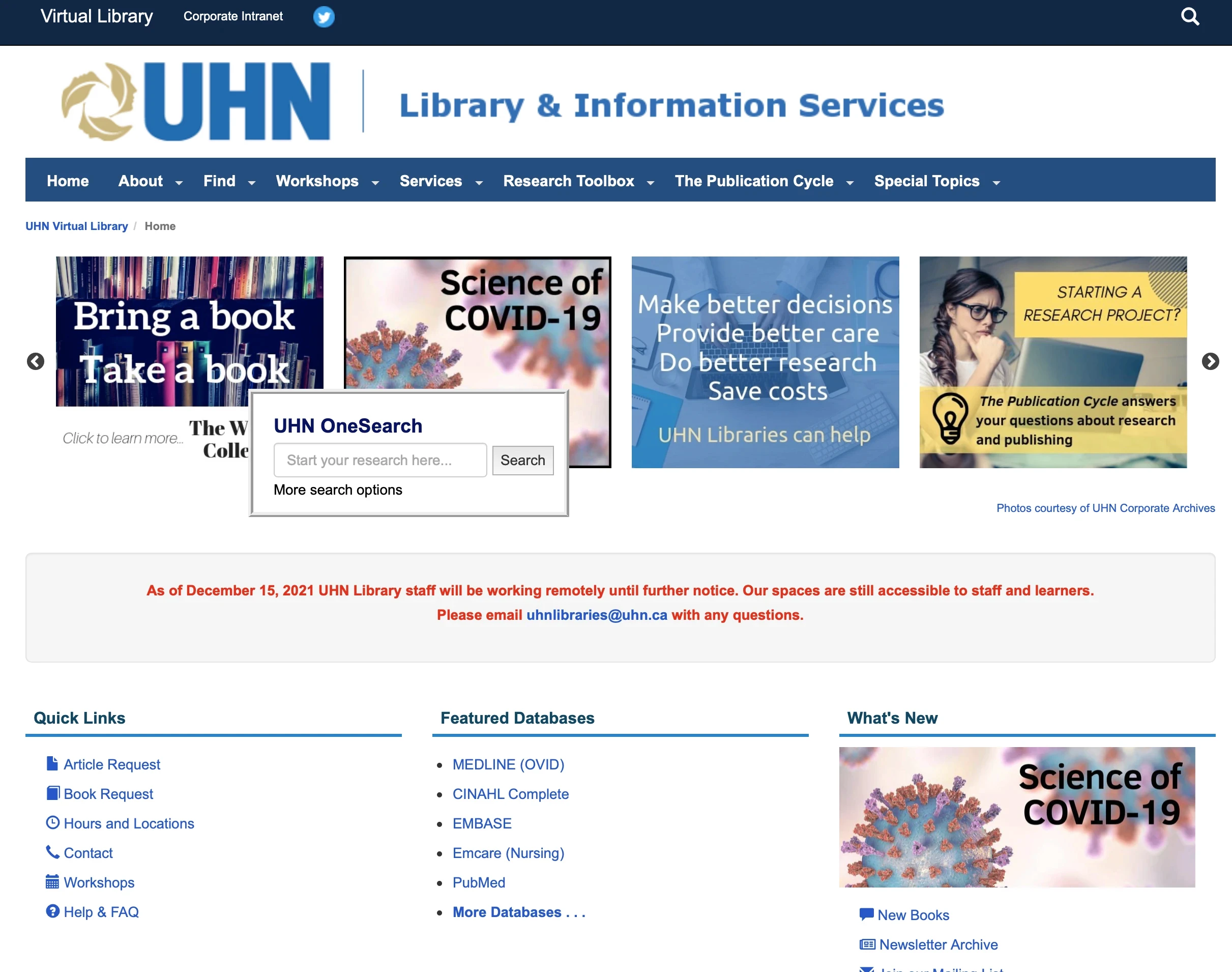
Based on the opportunities identified, I created a wireframe that centers the publication cycle with links on the homepage. The publication cycle is intuitive and immediately draws users’ attention. It also makes it easy for users to access the publication cycle links.
Main changes:
Make the search box more prominent
Make the navigation consistent
Make the publication cycle resources easier to find
Implement a chatbot

Unexpected issues
I presented the wireframe to gather feedback from the manager, engineering team, and users to understand their thoughts and assess feasibility. While the stakeholders appreciated placing more emphasis on the publication cycle, not all users liked the change. Accessing the publication cycle is just one important task on the website. Users might also want to book workshops or check citations, but these links are now hidden.
Everyone liked the cleaner design and the more prominent search box
Users could find item with ease using the redesigned top nav.
The publication cycle resources are much easier to find
Users liked to use the engaging chatbot to find pages
Iterating
I then showed them another version: incorporating the publication cycle into the secondary nav bar at the top. This approach frees up the main content area for other important links. Also, users can always access the publication cycle throughout the site. Additionally, it is closer to the current site layout, so the learning curve is flat.
Participants really liked our new design! The satisfaction rate went up, whereas task completion time and error rate all went down. The only concern was that the secondary navigation bar isn't intuitive without the context. We added labels to make it crystal clear.

Final prototypes
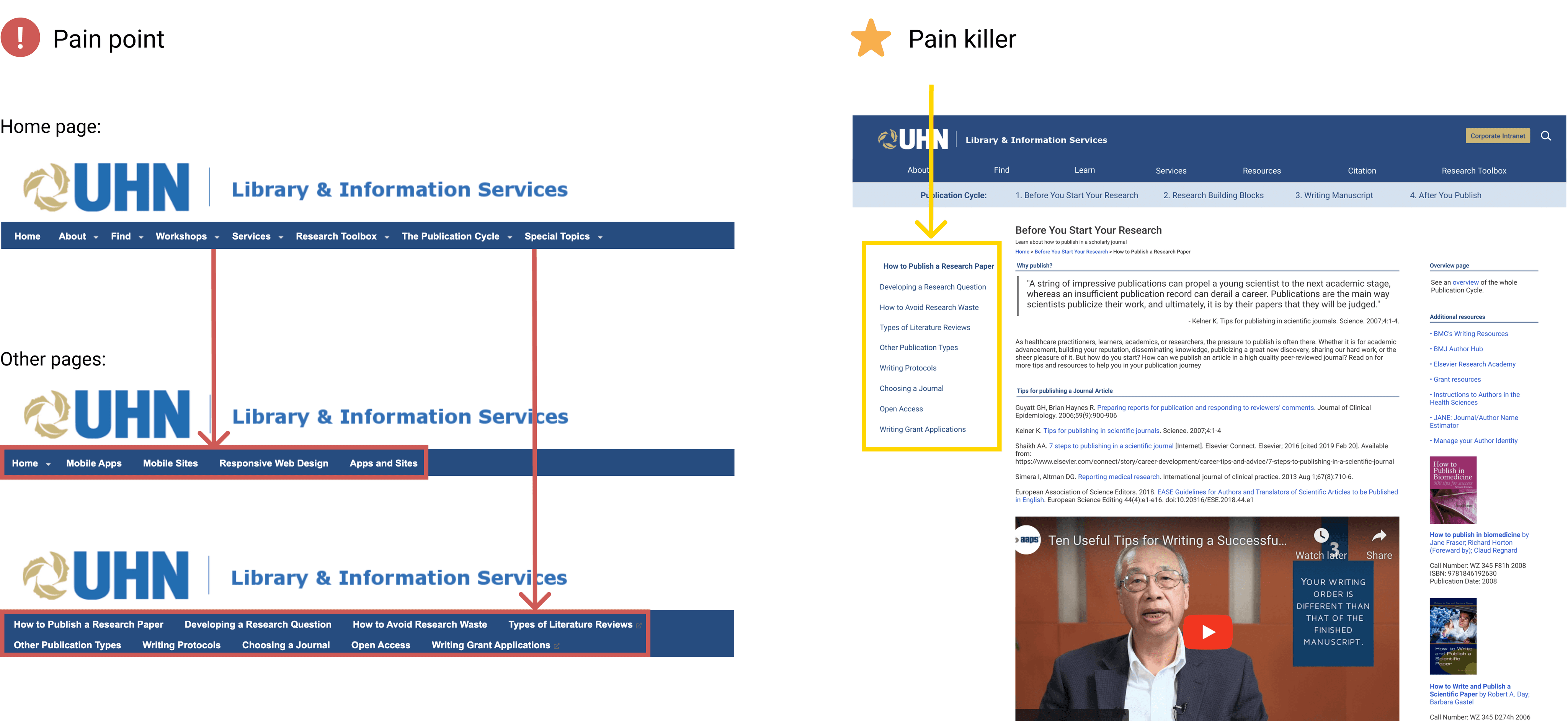
Pain point 1: Users are not aware of the publication cycle resources

Pain killer 1: Incorporate them into the secondary navigation menu to stay prominent across the site

Pain point 2: The top navigation is so cluttered and confusing that users avoid using it
Pain killer 2: Redesigned the site's IA and rename labels to avoid confusion

Pain point 3: The search box is hidden
Pain killer 3: Center the search box and remove the non-essential, distracting elements

Pain point 4: The top navigation is inconsistent across pages
Pain killer 4: Added sidebars on pages that require a third-level navigation
Pain point 5: Users still might have trouble find certain resources
Pain killer 5: Added a chatbot that helps users find pages quickly if they can’t find them themselves

Key achievements
I've grown tremendously over the course of the project. Here are key achievements:
Increased UX awareness. We involved stakeholders early on so that they can understand our design decisions. This collaboration not only streamlines communication but also allows us to gather valuable insights on the feasibility of our ideas, accelerating our project timelines.
Improved usability across the platform. No usability tests were conducted before we joined. We actively conducted user research and user testing to improve the overall user experience. We also learned it's not a one time thing - we need to repeat it over and over.
Established a design system: We defined the color, typography and button shapes. This has helped maintaining consistency across different parts in the sites.