+StoryMD Health

Design a manual health data entry tool

Design a manual health data entry tool

Problem statement

StoryMD began building an advanced patient portal called ‘+StoryMD Health’ with the vision of empowering users to add, track, understand, and act on their health data.

The goal of this project was to develop the manual entry feature for ‘+StoryMD Health.’ While we offer various methods for automatically adding data to the platform, such as syncing with hospitals and wearables, it remains essential to have a fallback option when none of these methods are available.

Overview

StoryMD is a US-based healthcare technology company that merges technology with curated health content to help users better understand their health data.

I joined StoryMD as a UX designer in 2022, as one of two designers in a company of around 50 people. I provide design that meet both business goals and user needs, and I am responsible for the UX and UI of key parts of the platform.

My role: UX designer

Methods: User research, user testing, prototyping, visual design

Teammates: Emily (UX designer)

Date: Feb - May, 2023

Understanding the problem

We involved developers early in this project because I wanted to get their feedback on development times. They insisted on reusing as many existing components as possible to speed things up, even when I mentioned that this might not work well for users. Their primary focus is launching as quickly as possible, with minimal regard for the user experience.

Mockup version 1

Mockup version 1

I quickly mocked up the first version based on developers' suggestions. This version had a ‘+’ button, which opened a modal where users could select a category by clicking on chips at the top and then they can fill out the fields. I had serious concerns about the design: the chips were not obvious, and the categories were confusingly organized. This added friction, making it unlikely that users would manually enter their data.

Advocating for iteration

In a follow-up meeting with the developers, I raised my concerns, explaining that we couldn't launch the feature in its current state - it's not usable. I proposed to redesign it, but the tech lead didn’t think it was worth the additional time. They agreed it needs to be improved, but they preferred to launch the version as is, and make changes later if users complain about it.

I didn’t give up. I knew I had to provide evidence to convince the team. So, I suggested pushing back the launch by a couple of days to allow me to conduct some user testing, and the team agreed. If users could successfully complete the task, we launch it. If not, I would make some easy to implement improvements based on their feedback before releasing.

User research

I tested 4 users on how they add manual entries. I showed them the existing design and asked them to add data in different categories. Every user I tested disliked it; they were either unable to complete the task or did so with confusion. The results confirmed my concerns.

Research findings and solutions

Key finding 1: Users couldn't find where to add manual entries.

Key finding 1: Users couldn't find where to add manual entries.

I thought the large '+' button should be clear enough that it's the manual entry button, but I was suprised when users told us that it's not intuitive without a label.

Solution 1: Add a button label and onboarding helps.

Solution 1: Add a button label and onboarding helps.

I added onboarding tutorials for first time users about where to add manual entires. Also, it's paired with a label now.

Key finding 2: On mobile, users didn’t like horizontal scrolling of chips

Key finding 2: On mobile, users didn’t like horizontal scrolling of chips

The horizontal scrolling of chips has poor discoverability and increases cognitive load, making navigation difficult. Users found it unclear that more options were hidden off-screen and expressed a preference for a high-level menu that displays all options at once before accessing the input modal.

Solution 2: Use an expandable button that allows users to see all options at once.

Solution 2: Use an expandable button that allows users to see all options at once.

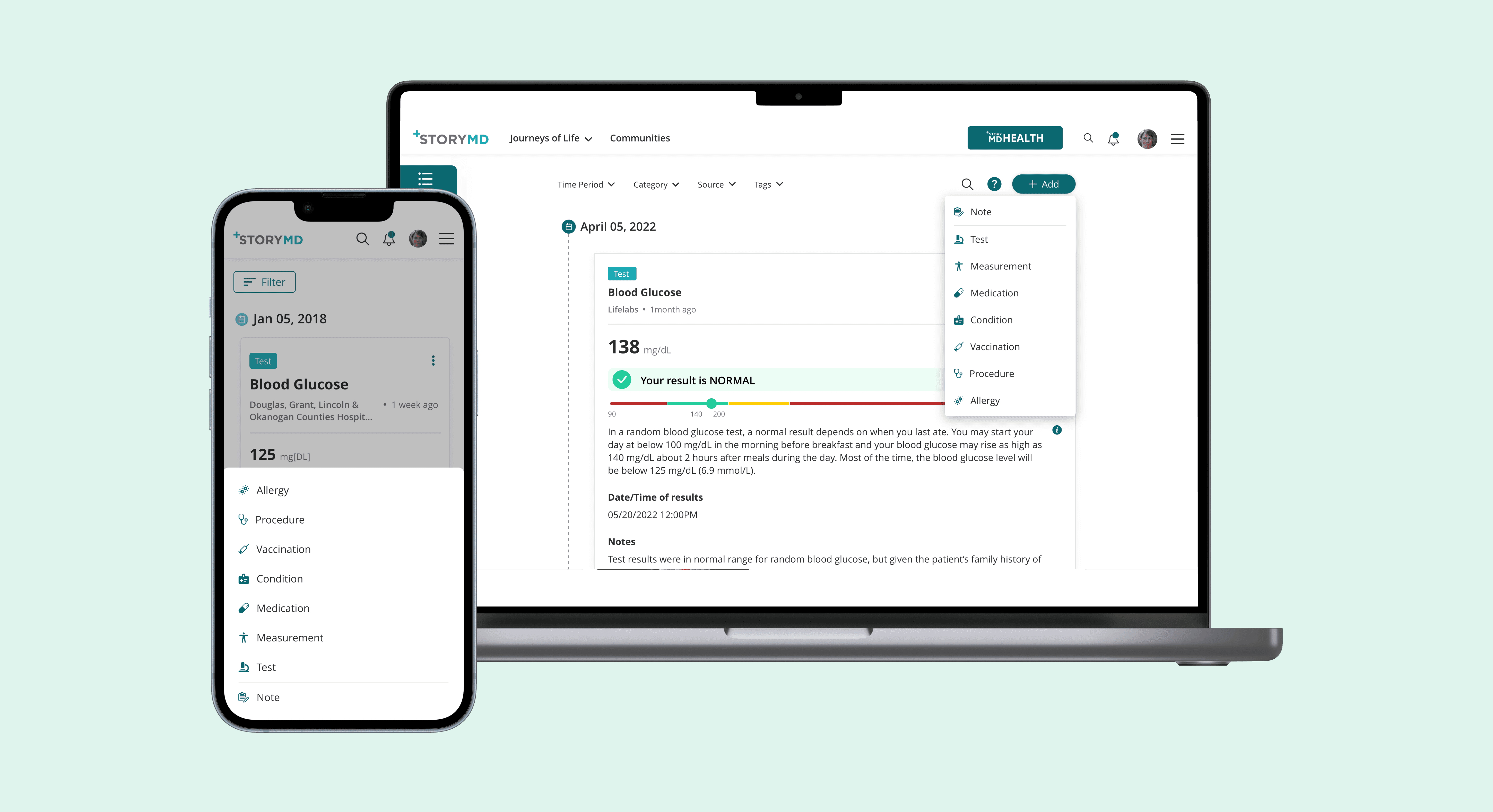
When users click the 'Add' button, they can see an expandable menu with all categories before going to the input modal. The menu contains seven items, which aligns with users’ cognitive limitations.

Key finding 3: The category terms are confusing.

Key finding 3: The category terms are confusing.

Originally, the team thought the categories should be self-explanatory, but there are lots of manual entries they users don't quite understand without the context. For exmaple, It's not intuitive what 'Procedure' or 'Lab Test and Measurement' mean without additional context.

‘I need at least a university degree to understand which chip to select.’

Solution 3: Rename the categories and provide exmaples

Solution 3: Rename the categories and provide exmaples

Since the 'Measurement and Lab Test' category was unclear, I conducted card sorting and split it into two categories. I added an onboarding screen with examples from each category and a list of top suggestions under the search dropdown to help users understand the categories.

Getting approval

‘I love it! It's much more strightforward and intuitive.’

I conducted usability testing with the same group of users, and they all loved the new design! They particularly appreciated not having to scroll and the onboarding screens.

When I presented the findings to the team, they unanimously agreed that the design was much better. The tech lead was impressed and agreed to implement it. Implementing the changes also wouldn’t require much additional development time, as many components could be reused.

Final results

I conducted usability testing with the same group of users, and they all loved the new design. They particularly appreciated not having to scroll horizontally and the new onboarding screens. We also saw improvements in task completion time and task success rate.

33%

Faster task completion time

25%

Increase in task success rate

Getting approval

When I presented the findings to the team, they unanimously agreed that the design was much better. The tech lead was impressed and agreed to implement it. Implementing the changes also wouldn’t require much additional development time, as many components could be reused.

Final prototype

Updates

The feature was shipped in May, 2023!

We have seen a growing trend in the number of users making manual entries. Additionally, I have received positive feedback from users about how simple it is to add entries manually.

Key takeaways

  1. Not afraid to speak up. As a new member of the team, I was initially hesitant when challenged by the tech lead. However, as a UX professional, I wanted to advocate for the user and provide my expertise. I'm glad I spoke up, which eventually resulted in a better UX.


  2. Consider development limitations. I intentionally reused as many existing components as I could, which sped things up and avoided excessive development effort.


  3. Conduct user testing prior to development. The initial mockups were implemented without any usability testing, leading to issues and resulted in wasting valuable development resources. It is far more efficient to have a solid design in place before development.

Overview

StoryMD is a US-based healthcare technology company that merges technology with curated health content to help users better understand their health data.

I joined StoryMD as a UX designer in 2022, as one of two designers in a company of around 50 people. I provide design that meet both business goals and user needs, and I am responsible for the UX and UI of key parts of the platform.

Project type: UX design

My roles: User research, user testing, prototyping, visual design

Teammates: Emily (UX designer)

Tools used: Adobe XD, Photoshop, Adobe Illustrator

Updates

The feature was shipped in May, 2023!

We have seen a growing trend in the number of users making manual entries. Additionally, I have received positive feedback from users about how simple it is to add entries manually. However, they are also requesting additional features, such as the ability to scan a lab report instead of filling it out manually. I won’t go into detail here, but we continuously refine the design.

Final prototype

Key takeaways

  1. Not afraid to speak up. As a new member of the team, I was initially hesitant when challenged by the tech lead. However, as a UX professional, I wanted to advocate for the user and provide my expertise. I'm glad I spoke up, which eventually resulted in a better UX.


  2. Consider development limitations. I intentionally reused as many existing components as I could, which sped things up and avoided excessive development effort.


  3. Conduct user testing prior to development. The initial mockups were implemented without any usability testing, leading to issues and resulted in wasting valuable development resources. It is far more efficient to have a solid design in place before development.

Let's connect!

Let's connect!

Let's connect!