
Discovery
Operating within a startup environment with limited resources, I used convenience sampling to kickstart our discovery phase with 5 users. While I recognized the limitations, it allowed us to identify low-hanging fruit usability issues fast.
Key findings
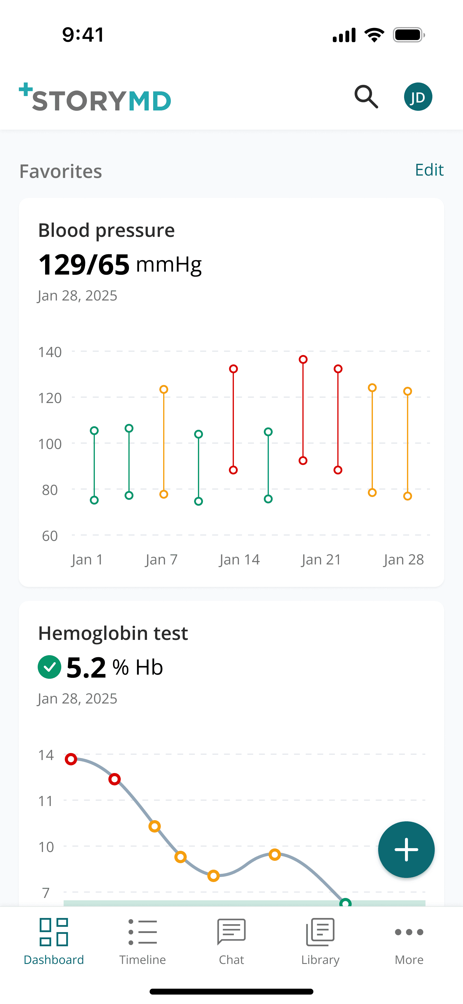
A single data point lacks context. Users need to see longitudinal trends to understand the "why" behind the numbers.
People hate logging into multiple hospital websites to find one piece of information. Most give up because it’s too much effort.
Users worry that their medical history is "gone" when they move to different cities or change doctors.
We prioritized four foundational ideas to balance technical constraints with user needs. We focused on two primary challenges: Effortless syncing and Clarifying results.

Unified health sync
Securely connect multiple health portals for continuous syncing in a single place.

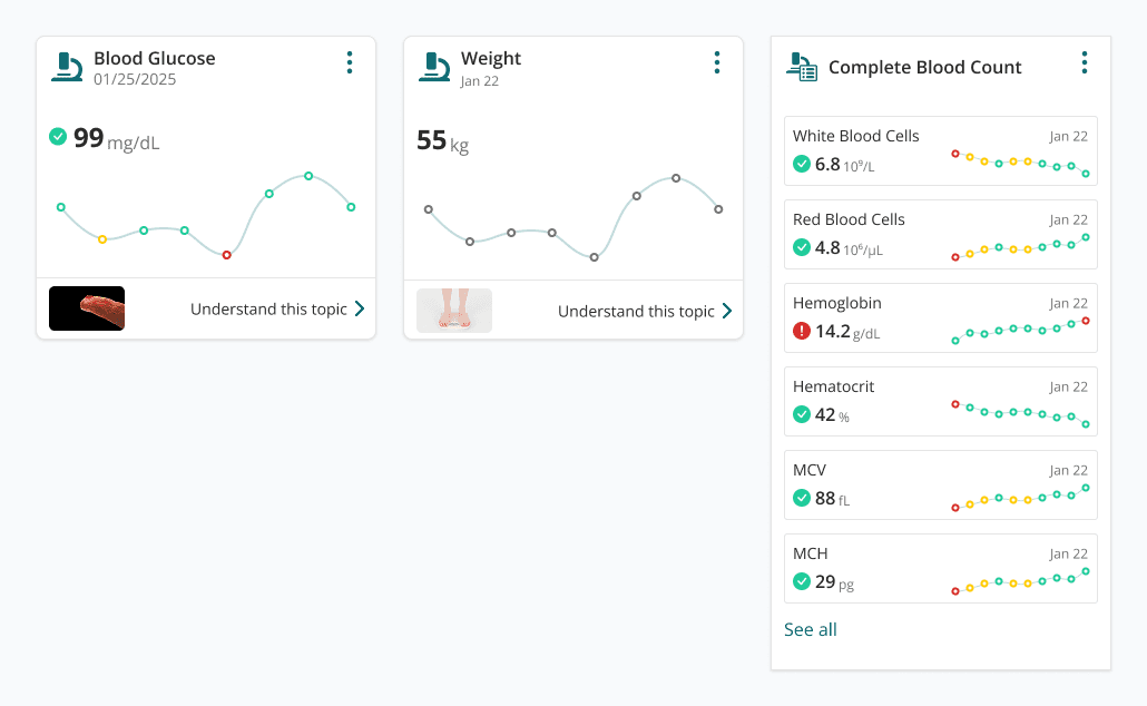
Comprehensive trends
Color-coded feedback and reference ranges that explain what the numbers actually mean.

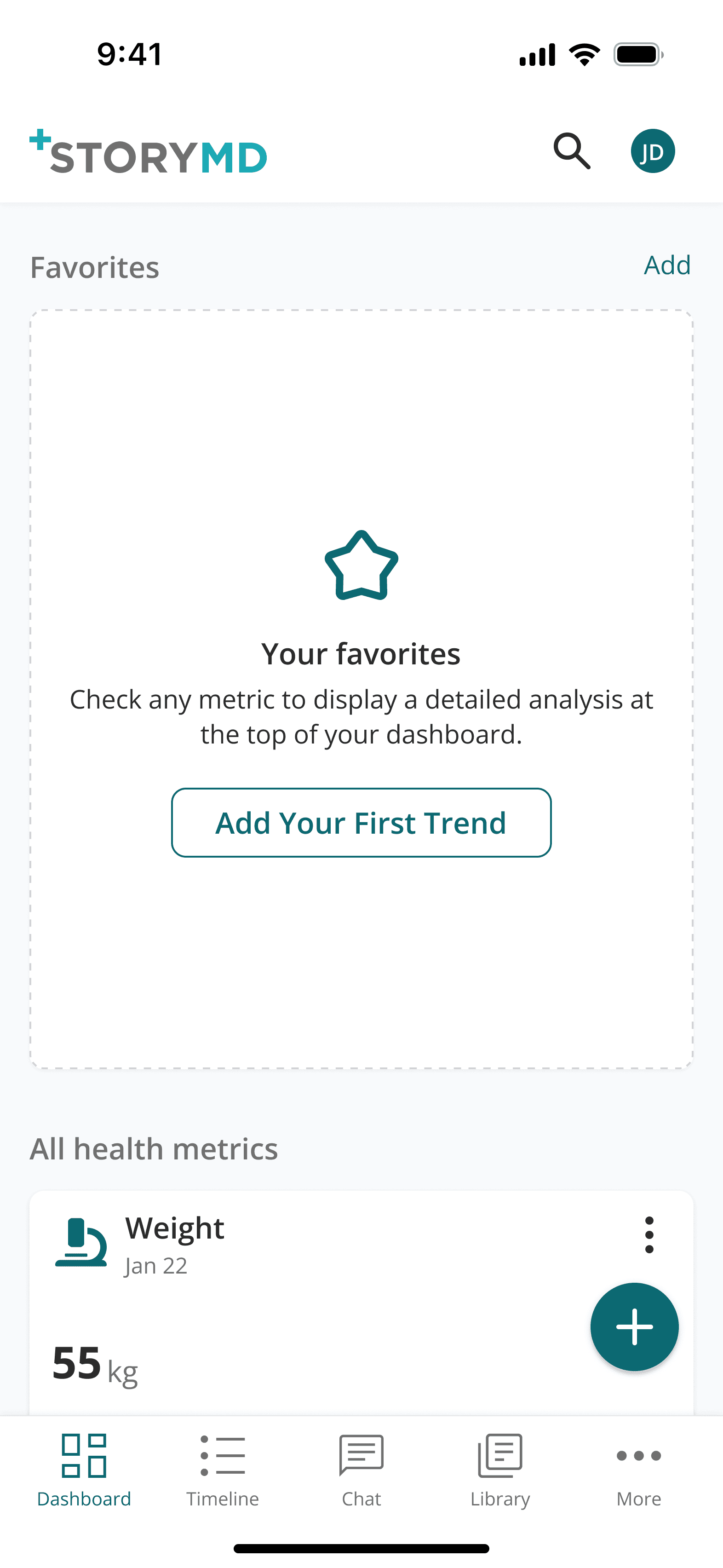
Pinned favorites
Gives users instant access to their most critical metrics by allowing them to pin key data points to the top.
Initial design
Based on our initial ideation, I quickly mocked up the V1. Our goal was to streamline the data-linking process while giving helping users better understand their health data.
I initially assumed syncing would take under 15 seconds, so we kept users in app to not interrupt their session. I also provided granular control over their data.


To manage a high-density clinical library without cognitive overload, I designed a system that allows users to pin any metric to a 'Hero' carousel, enabling them to view critical health trends at a glance.


To keep it clean and breathable, I used a square grid for these cards. I prioritized legible typography and clear categorization, allowing users to view their latest results at a glance without digging through complex menus.
Challenges & Iteration
Design is rarely a straight line. After our initial V1 concepts, we received critical feedback from usability testing and engineering team. These insights forced us to move past "ideal" designs and solve for real-world constraints.
The Problem: We designed the app for a quick 15 seconds sync, but the hospital servers actually took 5 minutes to send the data. Asking a user to stare at a loading screen for five minutes was unrealistic and would have caused most people to give up.
The Fix: I moved to a "fire and forget" model. Now, users trigger the update and can immediately close the app. I implemented a push notification to alert them the moment their data is ready, turning a technical lag into a respectful, non-intrusive experience.
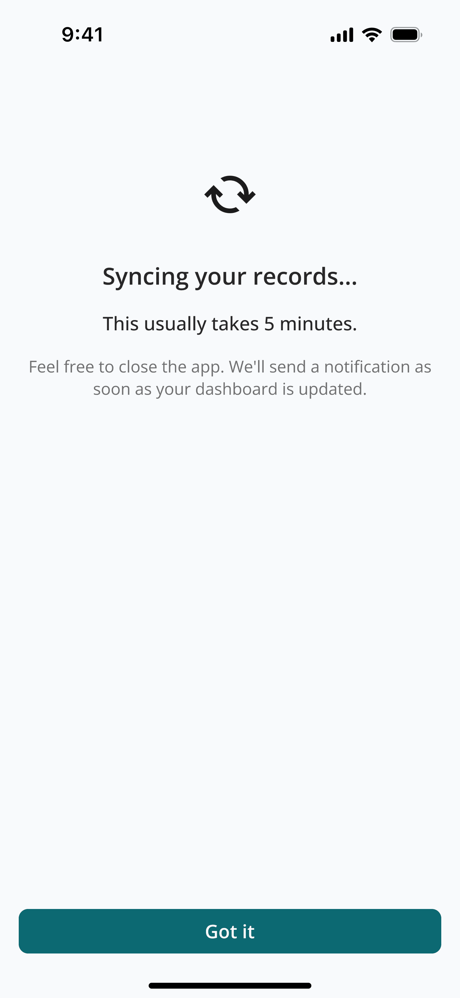
Message informing users this is gonna take 5 mins

When the sync is completed, they will get a notification.
The Problem: V1 used large square cards and prominent sparklines to create a "breathable" aesthetic. However, usability testing revealed that users found the layout "too spaced out", leading to interaction fatigue during extended browsing sessions.
The Fix: I transitioned to Condensed Horizontal Tiles to prioritize comparative scannability. By removing the read more links at the dashboard level, I increased information density by 2x. This allows users to view significantly more data above the fold.

The V1 square card layout suffered from poor vertical space efficiency

The new horizontal cards is much more efficient when browsing
The Problem: Users found the carousel confusing and tiring. Most didn't even realize there were more cards to see. Because they couldn't tell what was coming next, they usually just stopped at the first one.
The Fix: I replaced the carosel with a simple vertical list and added an AI option to fill it in automatically. By letting users just scroll down naturally and moving the extra date settings to a deeper page, I made the experience much more intuitive where the most important health info is never hidden.

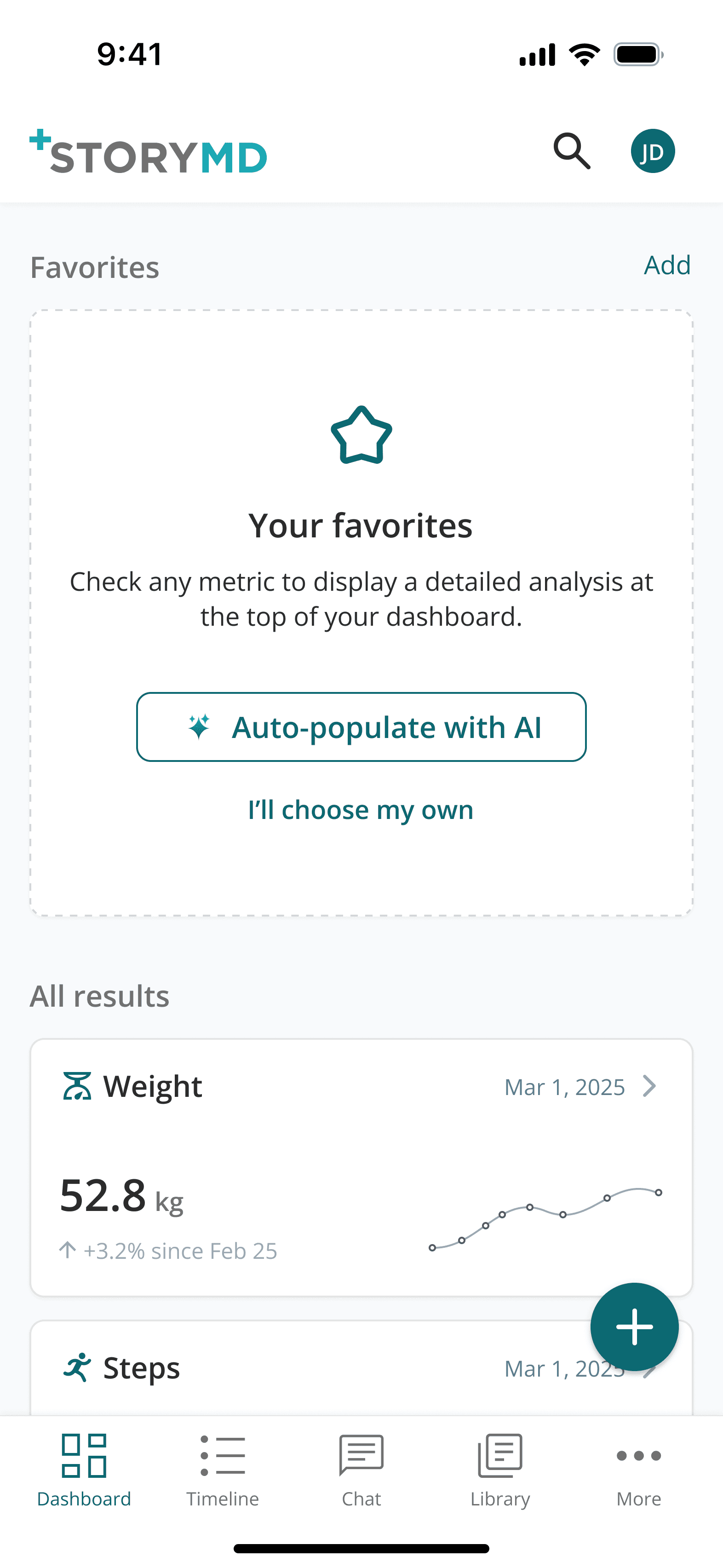
Empty state favorites
Vertical orientation of favorites for improved scannability
Final results
After iterating, I ran a final validation round with 4 participants to test the new changes. Here are the findings:
Faster Browsing: By replacing inefficient square cards with a condensed horizontal layout, I doubled the information visible "above the fold." Combined with a continuous vertical feed, this eliminated the need to swipe left and right, which significantly speeds up task completion.
Solving Data Overload: I moved the exhaustive list of biomarkers to a dedicated "All Results" page with search and filters. This cleaned the primary dashboard of visual noise, allowing users to focus on key health trends without feeling overwhelmed.
Decreased Drop Rate: Introducing a "Permission to Leave" screen successfully neutralized the anxiety of the "active wait." By removing the pressure to stay on a loading screen, we saw a dramatic decrease in abandoned sync sessions as users felt more in control.
The Impact
Final design
Add new connections
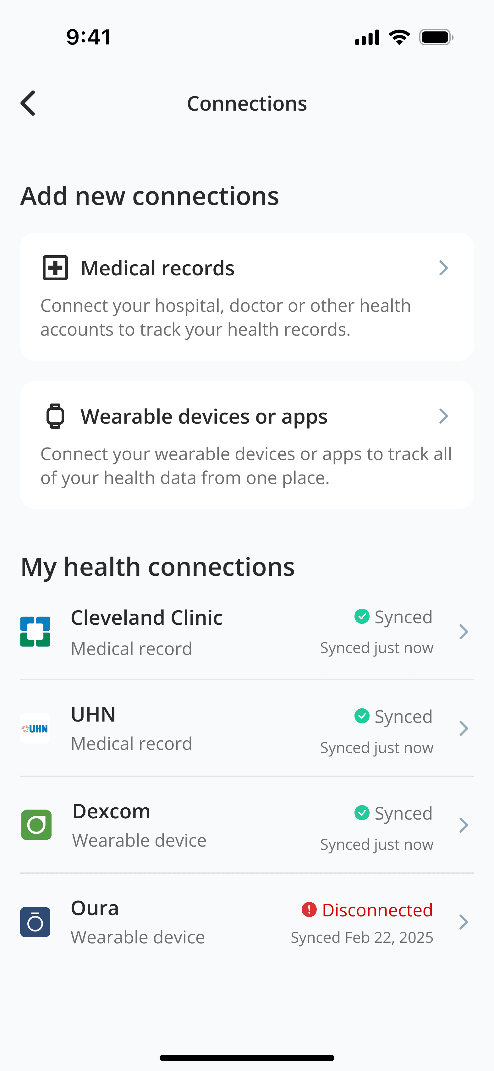
Add new connections screen
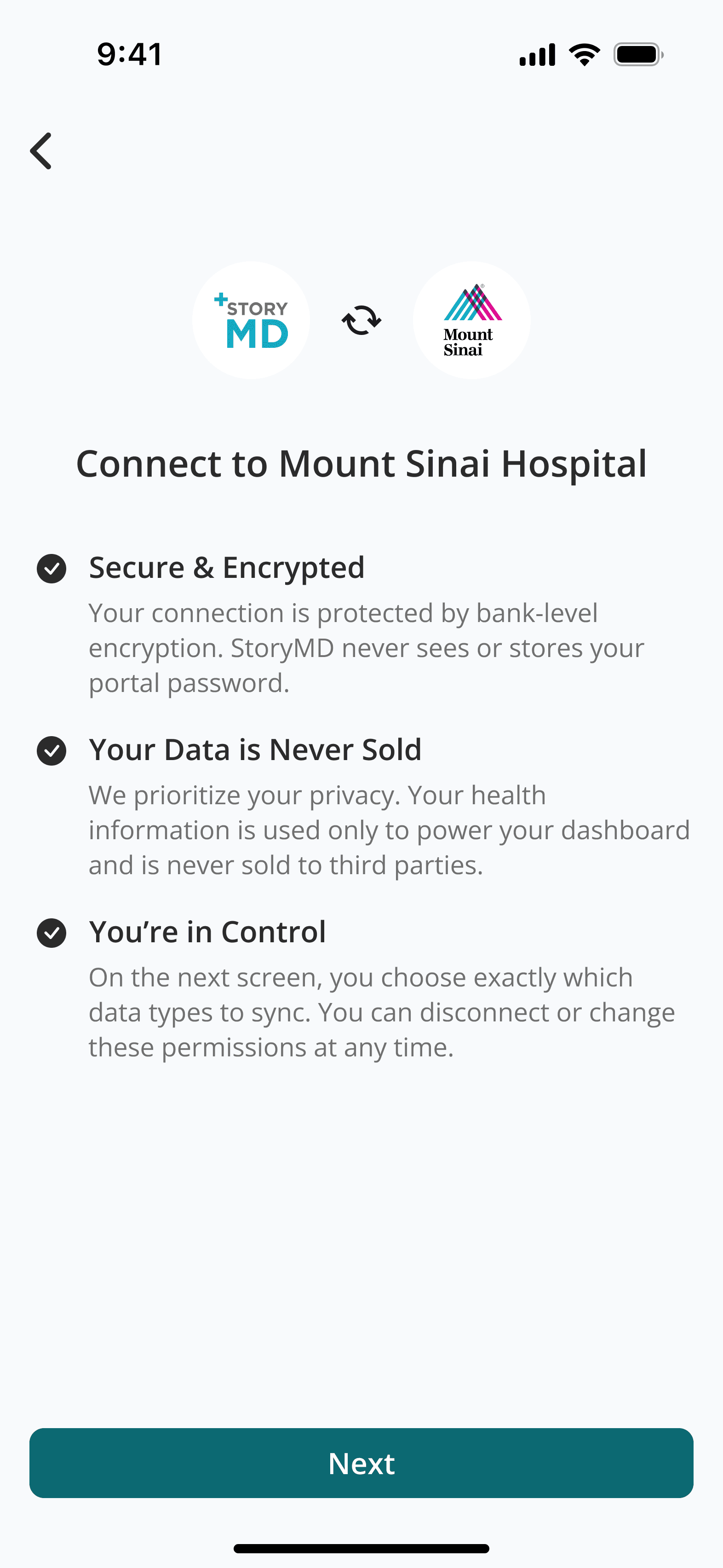
Connections onboarding
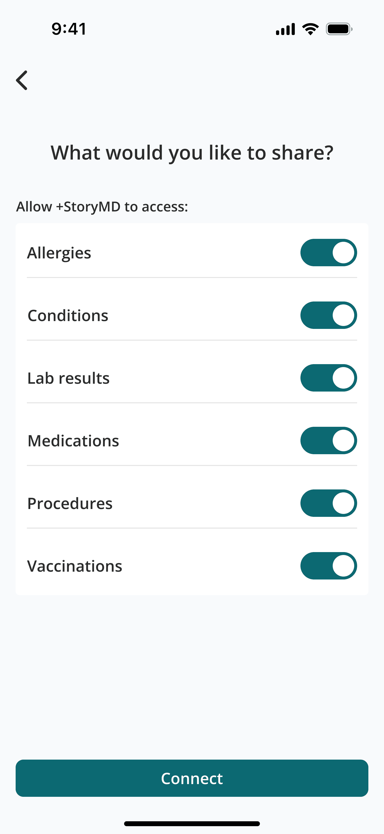
Set sharing permissions

Syncing info screen
Sync complete notification
Dashboard favorites
Empty dashboard favorites
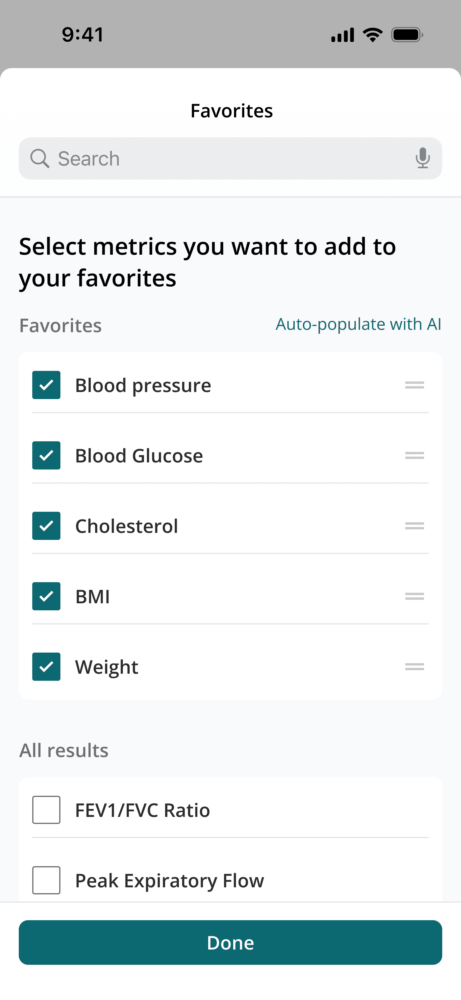
Manually add to favorites
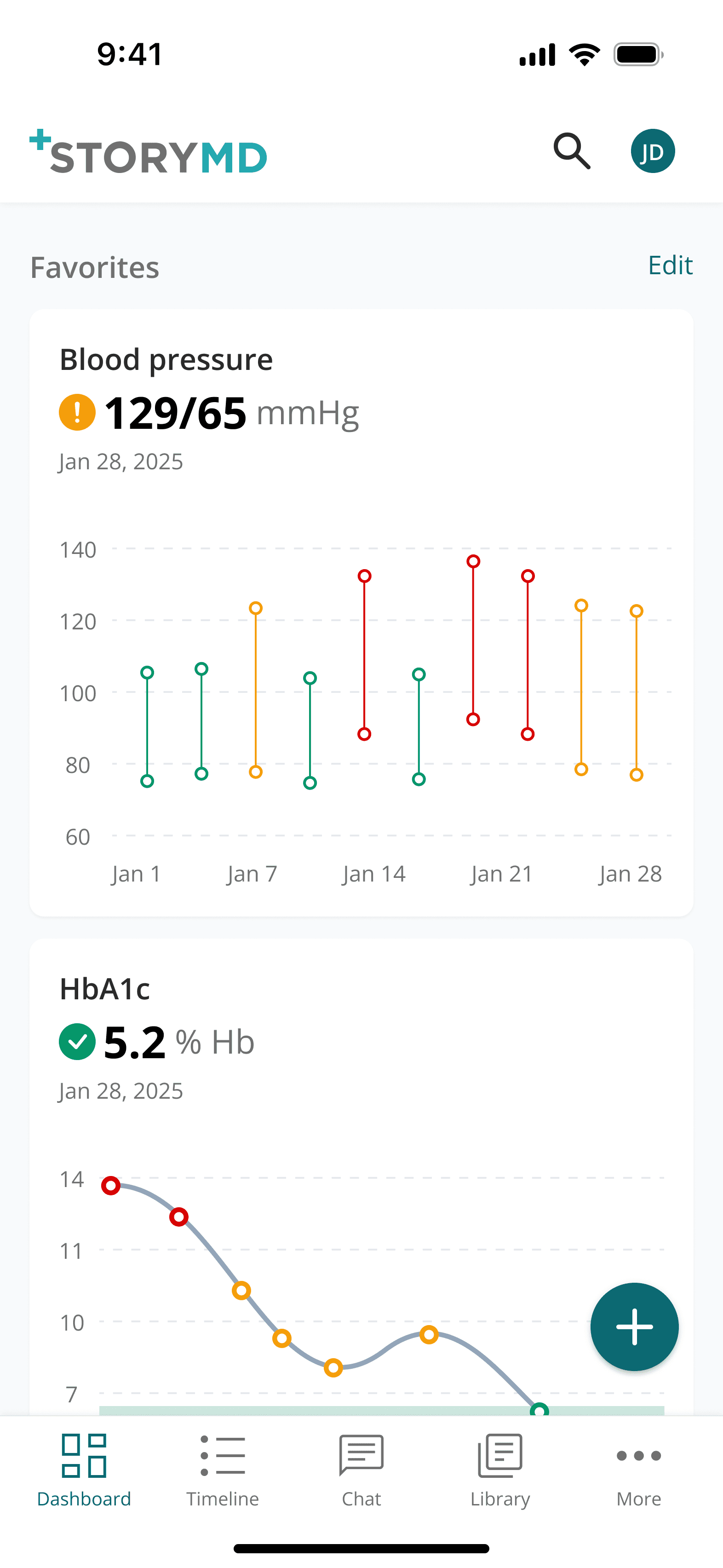
Favorites added, vertically oriented for rapid browsing.
All results
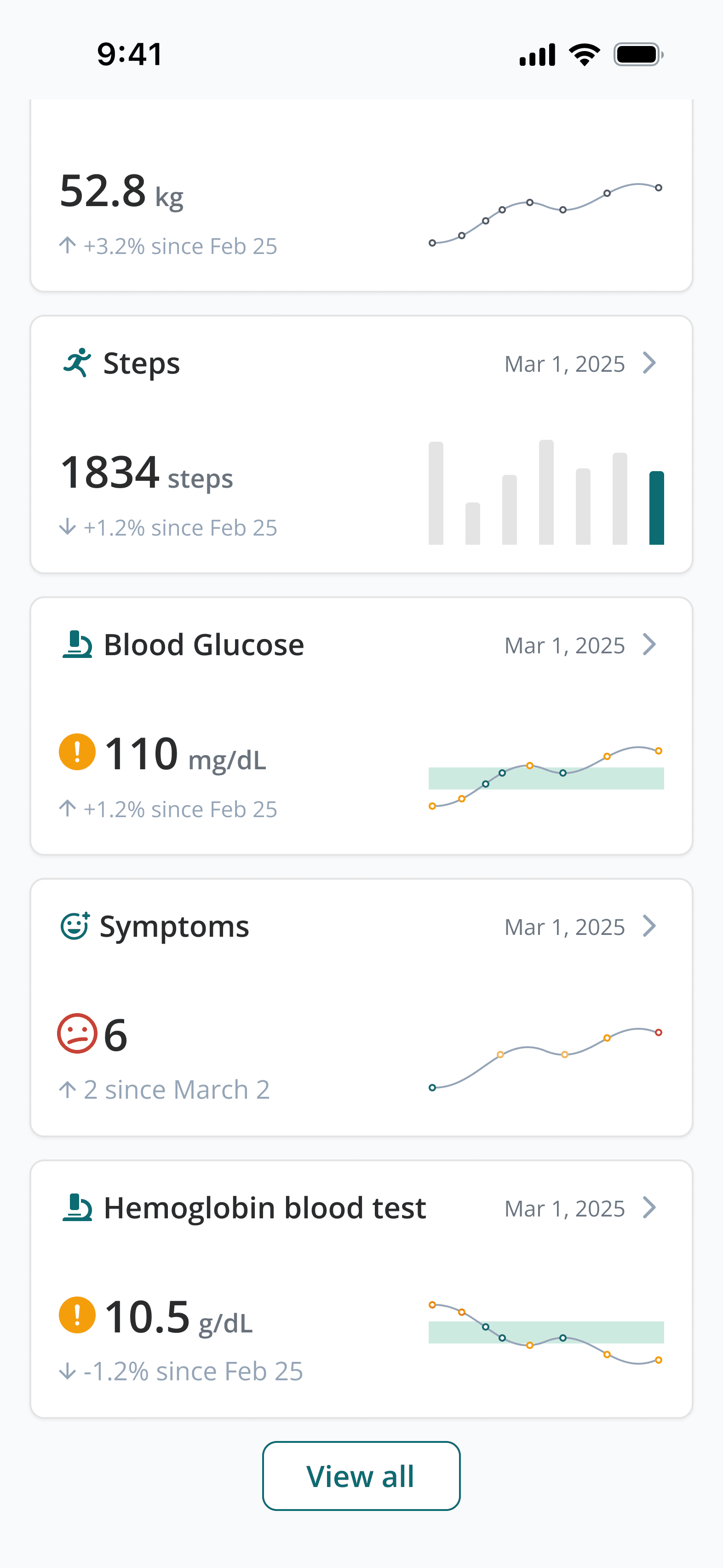
All results section with space-efficient horizontal cards for streamlined result browsing.
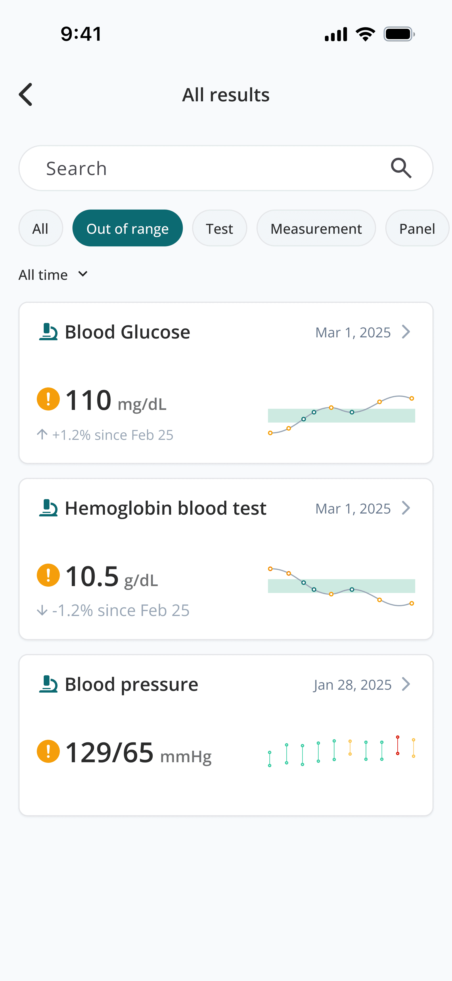
Search and filters make it much easier to find a specific card
Individual result detail page

Detailed result analysis featuring a date range picker and summary grid for historical context.
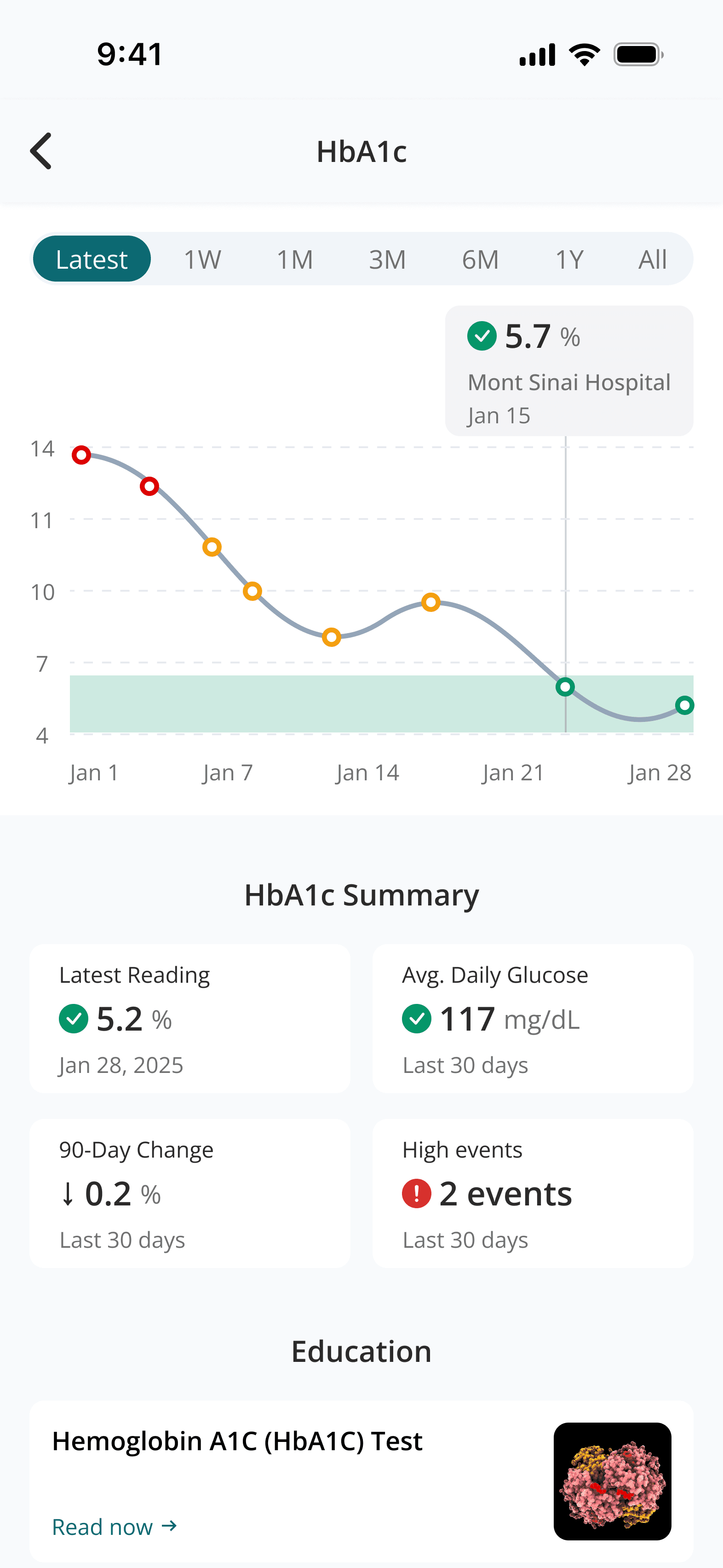
Hover state for a datapoint on the chart
